
Building a Design System in Figma
Overview / TL;DR
What kind of a system was it?
This is a complete design system built from scratch in Figma. It includes all foundational elements—like colors, typography, spacing, and grids—alongside a flexible component library with fully interactive, responsive elements created using Auto Layout and Variants. The system is designed to be scalable and modular, supporting consistent UI design across multiple platforms (web and mobile).
Why I Created It?
I created this system as a self-initiated portfolio project to deepen my understanding of system-based thinking in design and to demonstrate my ability to structure scalable UI assets efficiently in Figma. I wanted to build something that would mirror how real product teams approach design consistency, developer handoff, and long-term UI maintenance.
Who It's For?
While this project was not for a specific client, it was developed with real-world use cases in mind. The design system is structured in a way that it could be used by a solo designer working on a product, or easily expanded for use by a team—complete with clear file organization and documentation to ensure smooth collaboration and developer handoff.
COLORS
The color system is structured to balance both functionality and flexibility. Each color is assigned a clear role and broken down into states so that it can be applied consistently across different interface elements. The main categories include Greyscale, Primary, Error, Warning, and Success, supported by swatches and a defined set of main brand colors.
Greyscale provides the neutral foundation for surfaces, borders, and text. It covers essential states like title, body, subtitle, caption, disabled, and negative, making it versatile for layouts, typography, and secondary UI elements.
Primary defines the core brand color, with a full range from subtle to darker tones. This makes it adaptable across different states, whether used as a background surface, a border, or for emphasis in text and icons.
Error, Warning, and Success are functional colors that communicate system states and feedback. Each one follows the same structure of subtle, lighter, default, and darker, ensuring a consistent approach to alerts, validations, and notifications.
By designing the palette in this way, every color has a defined purpose. The states create flexibility without losing control, while the consistent roles across categories make the system intuitive for both designers and developers.
TYPOGRAPHY
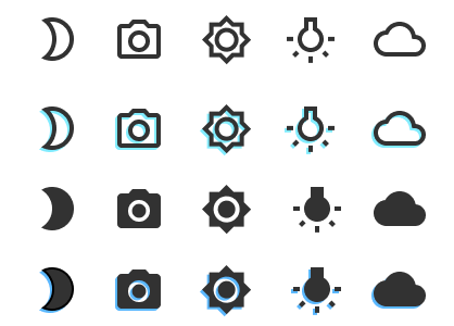
The icon set was designed with flexibility and consistency in mind. Each icon comes in four distinct variants that cover a wide range of use cases within the interface:
Normal: A simple outlined version for clean and minimal use.
Duotone: A two-color variation that adds depth and hierarchy without overwhelming the layout.
Filled: A bold, solid version that works well for strong emphasis or when icons need to stand out.
Duotone Filled: A hybrid style that combines the visual weight of filled icons with the layered detail of duotone.
By building these variations into the system, icons can adapt to different contexts such as navigation bars, buttons, status indicators, or empty states. This approach keeps the visual language consistent while giving designers flexibility in how they apply icons across different components and themes.
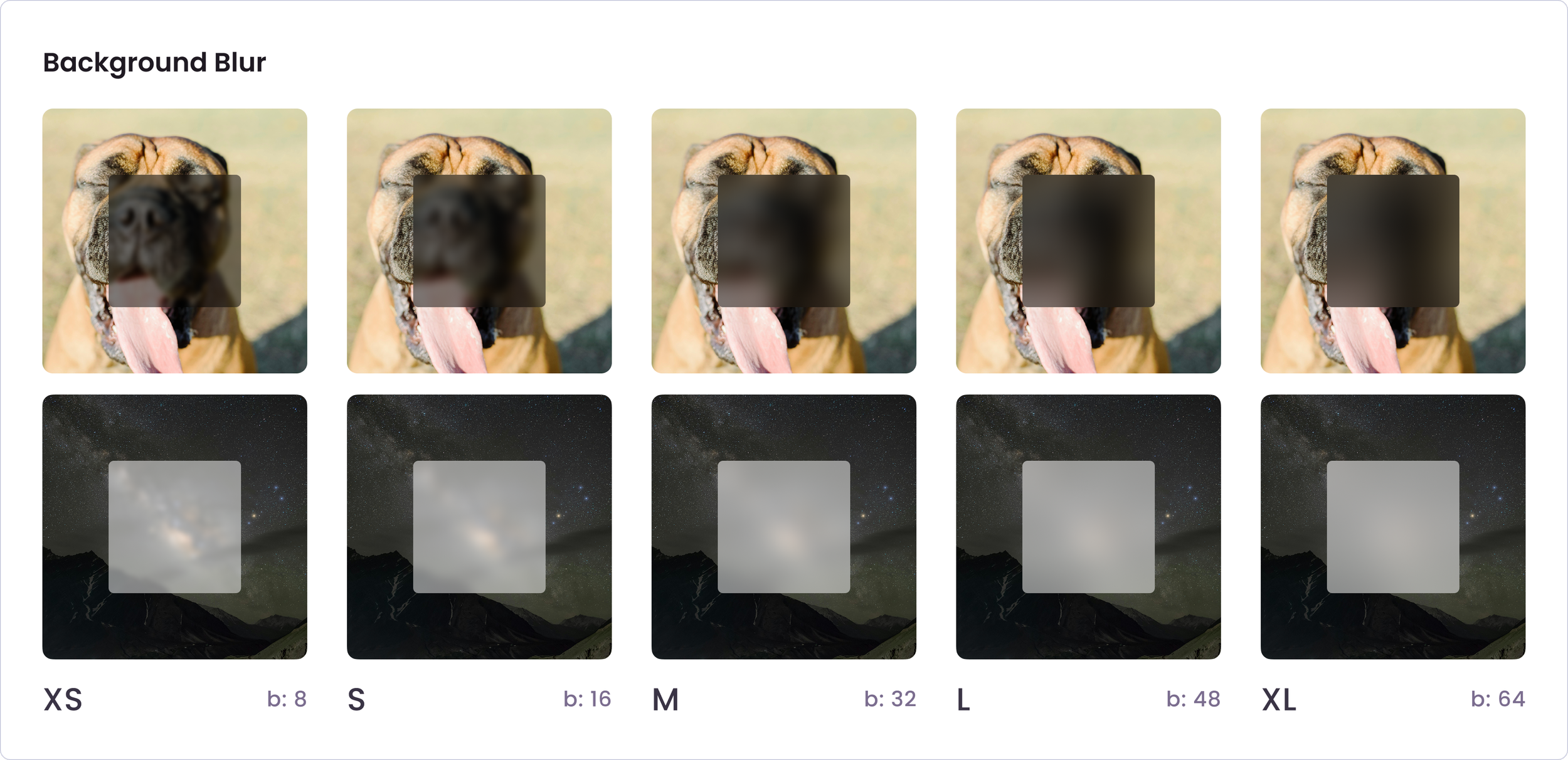
BACKGROUND BLUR
The background blur tokens define how much of the underlying content is obscured, giving designers flexibility when layering elements on top of images or complex backgrounds. The values scale from XS to XL, with each step increasing the blur radius:
XS (b: 8) – Subtle blur, keeps background detail while improving legibility.
S (b: 16) – Light blur, useful for tooltips or overlays that should remain airy.
M (b: 32) – Balanced blur, commonly used for modals or floating cards.
L (b: 48) – Strong blur, reduces distraction when more focus on the foreground is needed.
XL (b: 64) – Heavy blur, best for backgrounds where complete emphasis is required on the content above.
This scale ensures consistent visual treatment while giving flexibility depending on the density of the background and the importance of the foreground element.
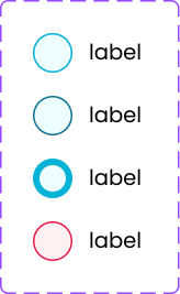
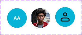
AVATARS
The avatar component was designed to be flexible and multi-faceted, giving designers three different variations to work with. Avatars can display a user’s picture, their initials, or a generic hologram for cases where no personal image is available. In addition, avatars also support status updates, which make it easier to show availability or activity at a glance.
This versatility allows avatars to adapt to different design needs while keeping the user experience cohesive and clear.
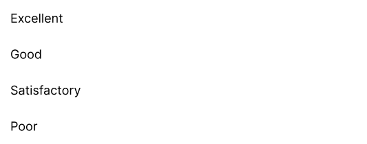
The dropdown menu was designed to be simple and intuitive. It allows users to make a selection from a list of options without overwhelming the interface. The focus is on clarity and ease of use, keeping interactions quick and straightforward. This ensures the component can be applied across different contexts while maintaining consistency.

For typography, I chose Poppins as the primary typeface. It is a modern geometric sans-serif that balances readability with a clean, approachable aesthetic, making it suitable for both digital interfaces and marketing content.
The type system is structured into multiple levels of hierarchy. Headings range from H1 to H4, providing flexibility for page titles, section headers, and smaller sub-sections. Supporting styles like Headline, Body, Subtitle, Caption, and Footnote ensure that every layer of text has a defined role, from emphasis and main content down to secondary details.
Each style is defined with multiple weights, including Bold, Regular, and Light, to allow for emphasis without relying solely on color. This approach keeps the system versatile while maintaining consistency across different use cases. By standardizing the type ramp, the design system ensures clarity, accessibility, and a cohesive visual voice throughout all components and layouts.
ICONS
CHECKBOXES
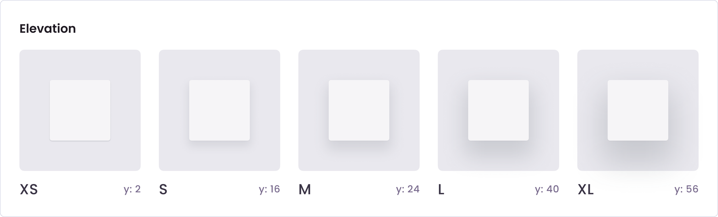
ELEVATION
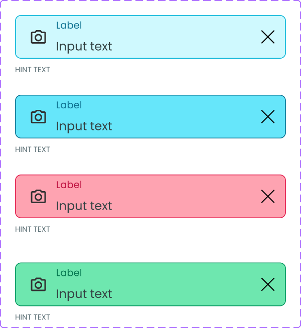
TEXT FIELDS
Elevation tokens define the depth and hierarchy of components by applying consistent shadow values. They help create a sense of layering, guiding the user’s attention and indicating which elements are interactive or in focus.
The scale increases from XS to XL, with each step adding stronger depth through higher shadow offsets:
XS (y: 2) – Subtle depth, often used for small UI elements like buttons or chips.
S (y: 16) – Light elevation, useful for cards or containers that need to lift slightly from the background.
M (y: 24) – Medium depth, provides stronger separation for overlays or popovers.
L (y: 40) – High elevation, typically used for modal dialogs or key interactive elements.
XL (y: 56) – Maximum depth, ideal for large surfaces that need clear distinction, such as navigation drawers or floating panels.
This scale ensures consistency across the interface while making it easier to communicate hierarchy and focus.
DROPDOWN MENU
Text fields allow users to input and edit information. Their design communicates interaction states and provides feedback to ensure clarity and usability.
Default – The resting state of a text field, with a clear border and placeholder text to guide input.
Hovered – The border becomes slightly highlighted to indicate that the field is interactive and ready for focus.
Success – Once input is validated correctly, the border and/or supporting text change to a success color to reassure the user.
Error – When input does not meet requirements, the border and/or supporting text highlight in an error color to alert the user and guide correction.
By keeping these states visually distinct, users can quickly understand the field’s status and respond accordingly. This helps prevent errors, reduces frustration, and creates a more intuitive form experience.
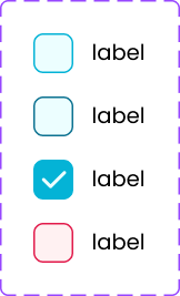
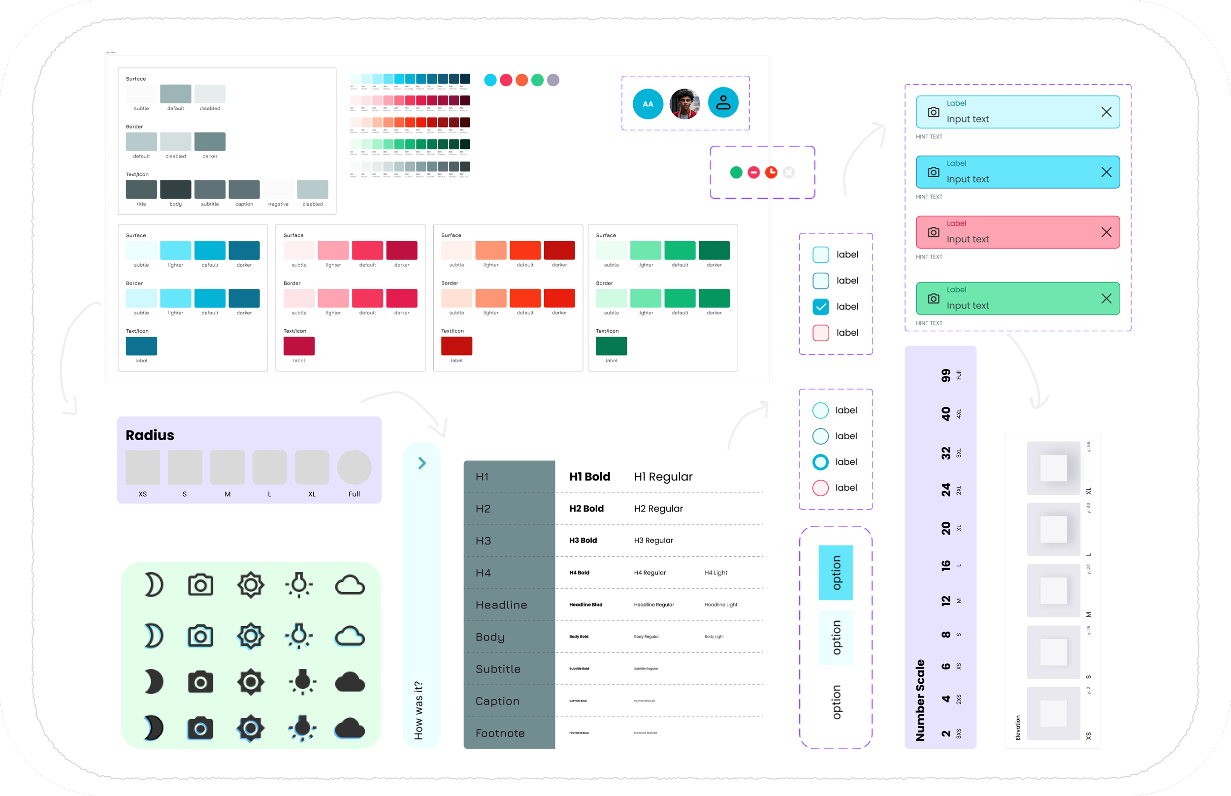
Checkboxes let users make selections or toggle options on and off. They are versatile components that can be used individually or in groups for multiple selections.
In this system, two variations of checkboxes are provided:
Square Checkbox – A more traditional option, offering a clean and familiar look that works well in most interfaces.
Circular Checkbox – A softer alternative, giving designers flexibility to match different visual styles or brand personalities.
By including both shapes, designers have the freedom to choose the style that best aligns with the overall design language of their product, while maintaining consistency in interaction and behavior.